Children's Hand Hygiene Company*
Overview: Scottish business specialising in equipment for children's washrooms, such as hand dryers and soap dispensers.
![]()
Isambard Community School logo*
Overview: logo developed from Y6 student workshops:
![]()
This is part of the identity guidelines I submitted with the digital logo files. The gold colour had been decided by the school governors prior to my involvment.
"Kate presented us with a number of prototypes which we debated and developed with her. We’re really pleased with the way she distilled all the words and ideas put to her into a strong clearly understood identity for Isambard." Children signed up for Isambard have declared the logo modern, funky and up to their expectations. Most importantly they’re willing to wear it. “Even those who did not attend the workshops could read the references to Brunel’s engineering excellence, and the sense that Isambard will give them the road to success and the way to reach for the stars."
From a press interview Headteacher, Rachel Mattey.
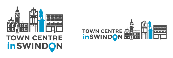
inSwindon BID Co. Ltd*
Overview: InSwindon is a not-for-profit Business Improvement District (BID) company working to develop the area fto benefit businesses and the community. , started with an audit of inSwindon's website and visual communication.
Create 'proud sense of place' to re-position Swindon Town Centre as a destination in-line with 5-year business plan, part of full re-brand. See inSwindon website
Old logo:
New logos:
Christmas Care homeless charity

Design for a small, volunteer-led charity in Swindon which opens each year for homeless and isolated people in the community.
Network Rail: national rail safety project identity

A last stage to Network Rail's multi-million pound safety initiative was to design a logo to 'brand' the project as it was revealed to an industry audience.
Willows Counselling Service logo
Previously an image – no logotype – that looked insubstantial. Redesigned to look confident, solid and definite.

ToyGuard stationery

Nappyapp: mobile phone application

Nappyapp identifies where the nearest babychanging facility is for parents on the go. Users are able to add and rate locations. With the intention of launching Nappyapp overseas the Union Jack was incorporated to distinguish the British app.
Lemon Squeeze
![]()
Lemon Squeeze "believe that companies can boost their creativity, employee engagement and productivity by injecting more humour into today’s workplace. We aim to provide valuable business skills in a way that engages people and makes them laugh." Coaching for confidence, creative thinking and engaging communication plus stand-up comedy courses.
Flapjack Music
 Music production company.