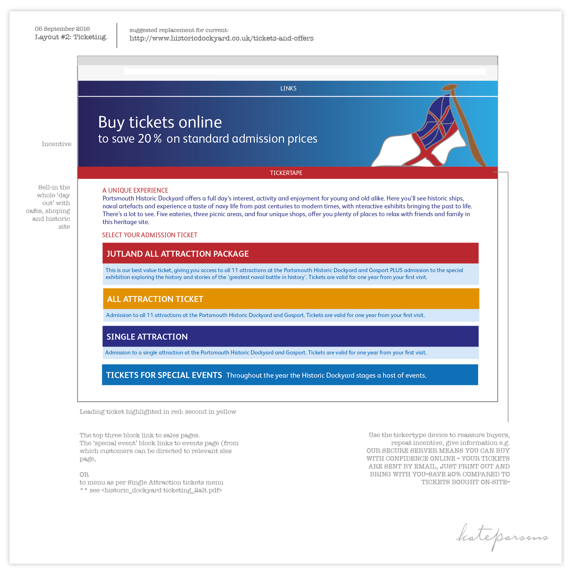
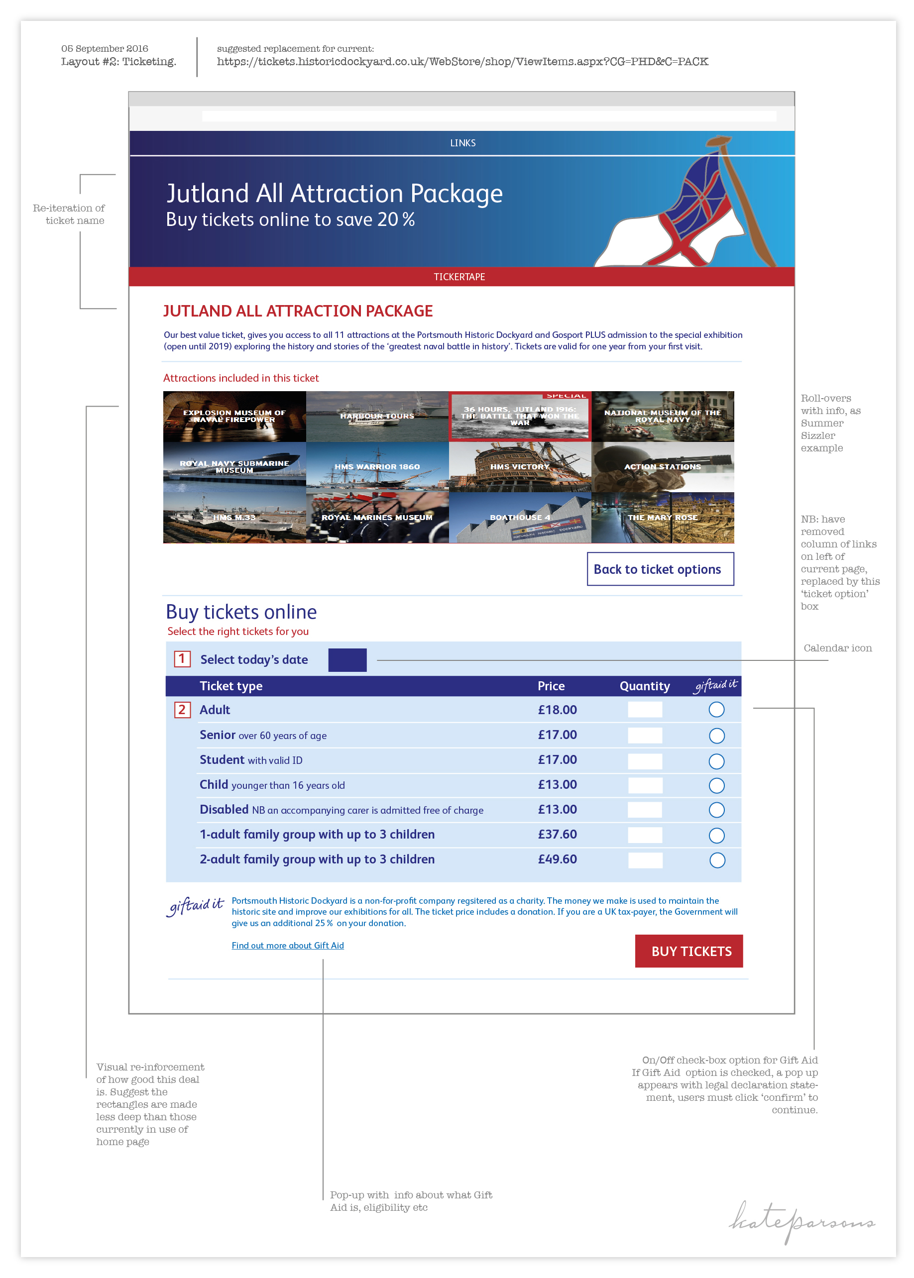
Visual system: UI design*
Client: Housemark
Overview: Housemark’s GIS, geo-spatial platform – Explore – allows social housing landlords to manage their housing stock and understand the local markets in which they operate..
Role: User Interface (UI) designer
Brief, aims and outcome: Briefed by GIS programmers (Nautoguide Ltd) to devise an online visual system to differentiate stockholders – social housing associations, local authorities and private landlords – tenants and market rent levels, as well as show the saturation of the area and detailed data attached to each asset, following their framework parameters.
UI visual sytem concept presentation:

Portsmouth Historic Dockyard: user experience (UX) review
Review of the whole customer journey
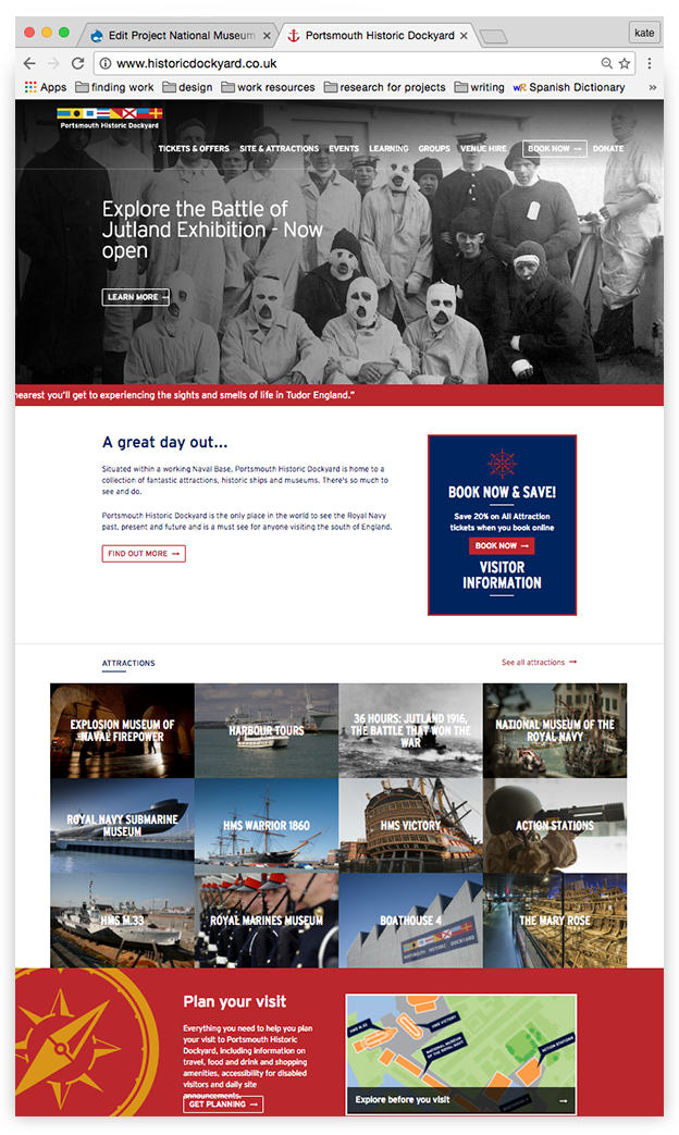
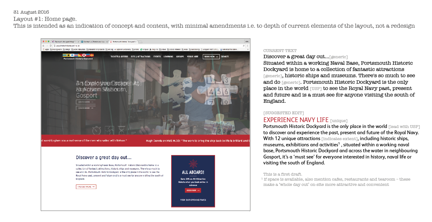
First stage was to review the existing pages and submit a report which flagged every stumble experienced when using the site. With header images that were too deep, and graphics taking up too much vertical space, users had to scroll down the page to find pertinent information – but the initial view did not indicate this. There was no budget, or desire, to redesign the website: a work-around was to make header images less deep, and move the visual list of attractions up. The list gives a great impression of the wealth of the attractions at Portsmouth Historic Dockyard. The text introducing the Dockyard was rather generic ("A great day out" is a line used by myriad attractions), re-ordering the text helped highlight the unique value of the Dockyard's proposition.
The original homepage
Part of the report with suggested edits
Ticket sales UX
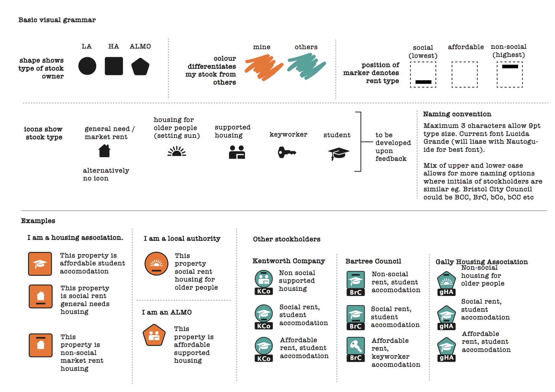
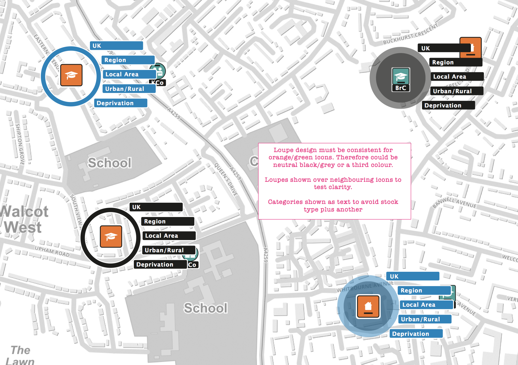
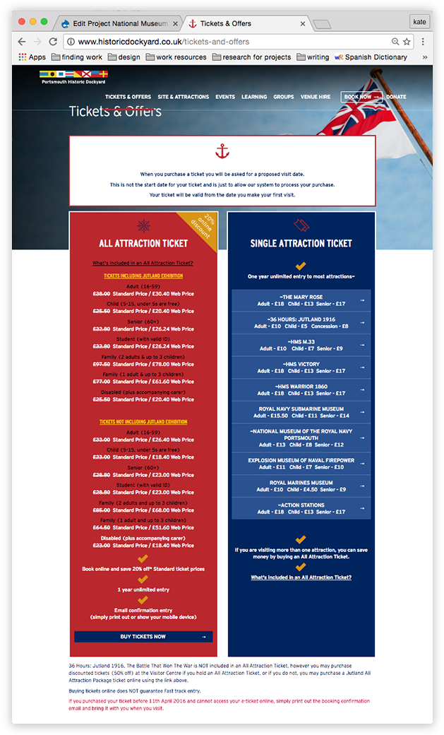
The tickets landing page was headed by an explanation of a glitch in the sales software – thus customers were greeted with a negative. The many ticket options were confusing and hard to compare. The remedies suggested were simpler text and a clearer, functional layout. Again, a report, with recommendations was submitted before layout.
The sales software required a date, so changing the instructions (that were not on the landing page) asking for customers to input today's date was a cost-free work-around.
The original ticket sales landing page
New layout for ticket sales header page with four clear options. The Dockyard wanted to drive sales to their two 'all attraction' tickets (hence colour emphasis), with the option of buying tickets for single attractions to still be very visible.
