Infographics: How things work
Emmaus Bristol (homeless charity)
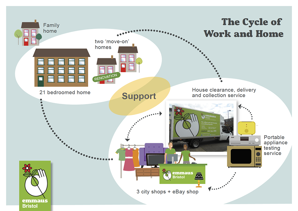
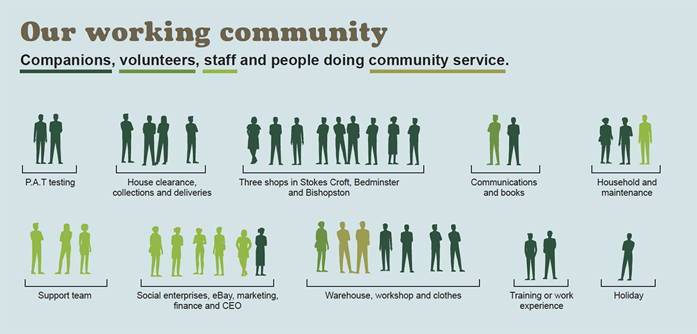
The charity's model is unique: offering homeless people accommodation, support and work. By working for Emmaus' social enterprises the service-users contribute to earning income to sustain the organisation that, in turn, supports them. Service-users are equal members of the Emmaus team.Here are two slides from the presentation I created.
Infographics: stating the case for support
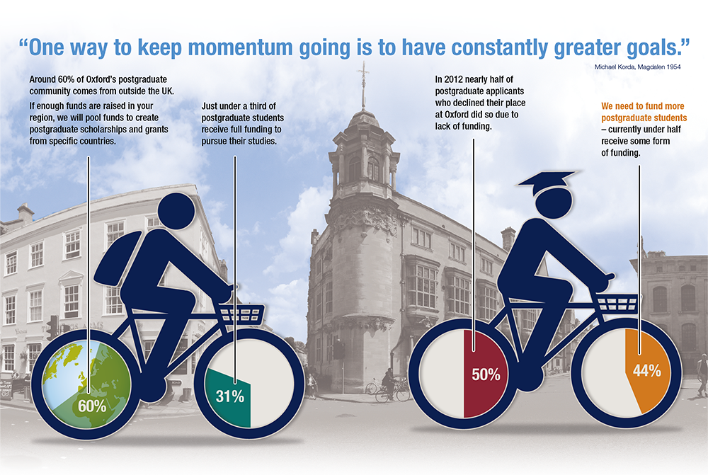
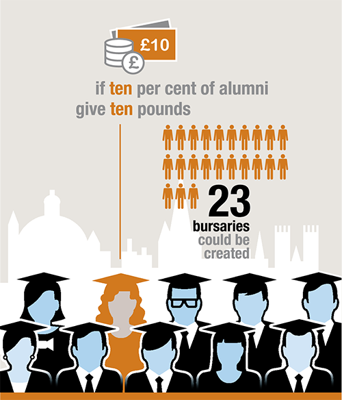
University of Oxford's annual appeal to alumni
This page from the 6-page printed mailing sets out the need for funds to recipients with an established connection to Oxford. The mailing gained a 41.5% increase in response rate over the previous year.
Infographics: numbers in context
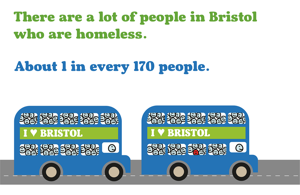
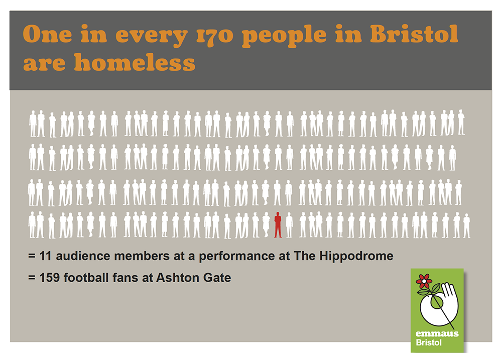
Visualising homelessness
Numbers are difficult to grasp. One in every 170 people in Bristol is homeless according to a Shelter report in 2017– is that a lot? The numbers are easier to understand using people's frames of reference. In Bristol homelessness affects one person on every second bus that goes past at busy times, or 159 fans at the football stadium. Two versions from my slide presentation, one for primary-school children and another for adults.
Infographics: how important are we?
Illustrating the importance of Arnos Vale cemetery to the community
Re-positioning a cemetery as an established community resource (case-for-support document for prospective funders). Life events (weddings and funerals) bring fewer visitors than special leisure events such as tours and films: most people visit the site because they can (and it's lovely).

Infographics: communicating impact
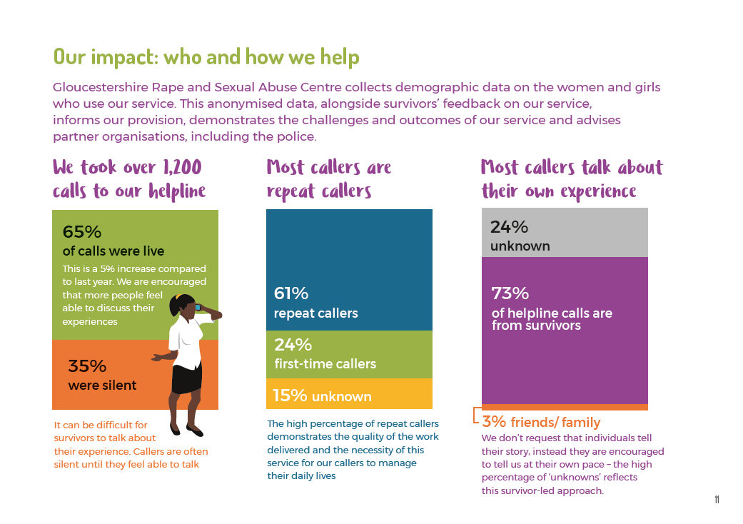
Showing that your service makes a difference
Charities collect detailed data to inform the way they run their services. My job is to decide what data best illustrates who they help, and the positive impact they make. It's the visual equivalent of a newspaper headline (with sub-head!):
About a third of callers to our helpline are unable to speak (subhead explains why).
Almost two-thirds call multiple times (our helpline is useful).
Most callers are personally affected (but there's no pressure to tell anyone specific details).
Infographics: showing your area of impact
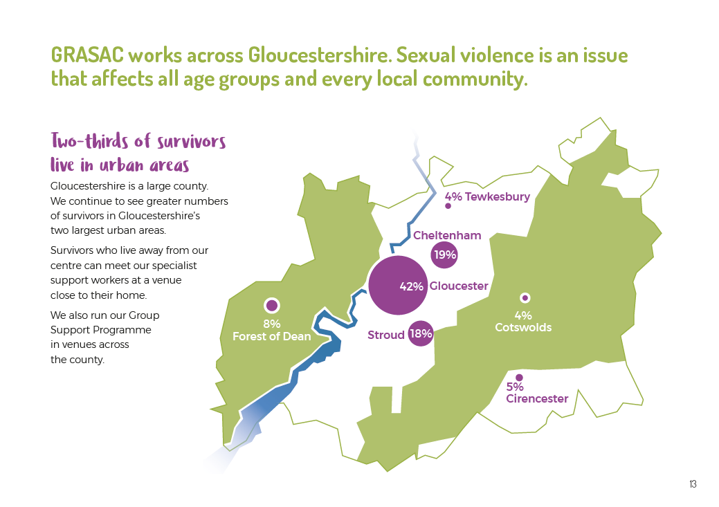
Where Rape Crisis services are most needed
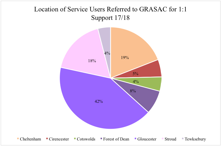
Infographics 'humanise' data. The pie-chart the client supplied is below. supplied. This page from GRASAC's annual report communicates the area of operation, the spread of its services and the statistics.
