Children's Hand Hygiene Company*
Overview: Scottish business specialising in equipment for children's washrooms, such as hand dryers and soap dispensers.
![]()
inSwindon BID Co. Ltd*
Overview: Business Improvement District (BID) company working to develop Swindon Town Centre.
Create 'sense of place' to re-position Swindon Town Centre as a destination.
Old logo:
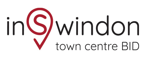
New suite of logos:

Sarkis*
Scottish management consultancy

Christmas Care homeless charity

Design for a small, volunteer-led charity in Swindon which opens each year for homeless and isolated people in the community.
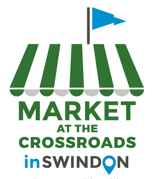
Town Centre Market*
In 2021 the open market returned to Swindon Town Centre
Willows Counselling Service logo*
Left: previous motif;
Right: Redesigned to look confident, solid and definite (part of project to audit comms and re-brand)

ToyGuard stationery

Nappyapp: mobile phone application

Nappyapp identifies where the nearest babychanging facility is for parents on the go. Users are able to add and rate locations. With the intention of launching Nappyapp overseas the Union Jack was incorporated to distinguish the British app.
Isambard Community School logo*
Overview: logo developed from Y6 student workshops:
![]()
This is part of the identity guidelines I submitted with the digital logo files. The gold colour had been decided by the school governors prior to my involvment.
"Kate presented us with a number of prototypes which we debated and developed with her. We’re really pleased with the way she distilled all the words and ideas put to her into a strong clearly understood identity for Isambard." Children signed up for Isambard have declared the logo modern, funky and up to their expectations. Most importantly they’re willing to wear it. “Even those who did not attend the workshops could read the references to Brunel’s engineering excellence, and the sense that Isambard will give them the road to success and the way to reach for the stars."
From a press interview Headteacher, Rachel Mattey.