Overview: All projects start with a review of client's previous communications and research into sector communications to help define the brief, aims and outcomes. These audits and reviews are stand-alone projects or initial work on re-branding projects.
Charity fundraising communications audit/strategy*
Client: Gloucestershire Rape & Sexual Abuse Centre (GRASAC)
Brief, aims and outcome: Initial audit of charity website – content, UX, design. Included comment on brand – logo and tone of voice.
See new brand
See communications strategy outlining communications aim, identifiying target audiences, engagement and implementation timeline :
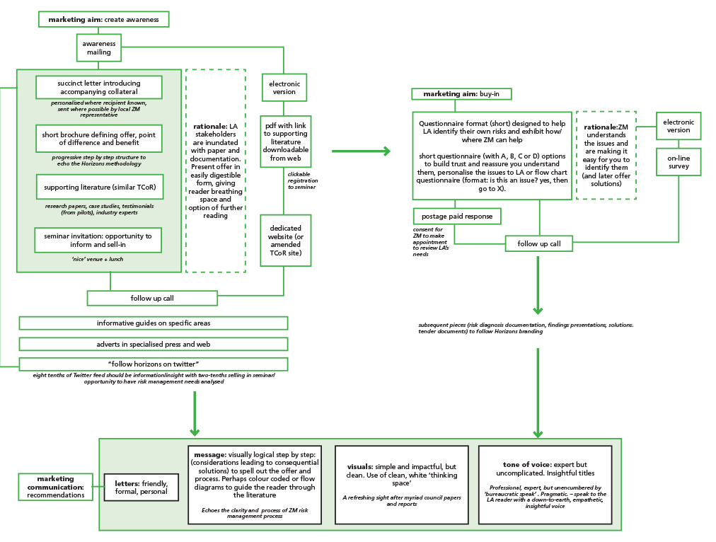
Brand communications review/recommendations for cost-effective re-brand*
Client: Willows Counselling Service
Overview: Mental health charity. Review ahead of its recruitment of its first fundraising and marketing officer.
Review/recommendations: online ticket sales (UX)*
Client: Portsmouth Historic Dockyard, Portsmouth
Brief, aims and outcome: Audit user experience (UX) online route-to-purchase to counter poor ticket sales; whole website review; produced report with recommendations on changes to text, content and layout.
Beauty salon brand review, recommendations and re-brand concept*
Client: Bloomin' Beautiiful
Overview: Beautician SME plus salon space rented to for self-employed hairdressers
Brief, aims and outcome: Looked at whole look and feel of the salon – interior decor and signage, logo, brand. Recommended cost-effective fre-brand to take the business forward.