Charity communications rebrand*
Role: Existing fundraising communications' review, communications strategy, brand development/implementation. Employed as Supporter Engagement & Fundraising Officer (p-t) to improve public awareness, raise funds and steward donor relationships. Later freelance contractor.
Also see GRASAC annual review/case-for-support and fundraising mailer created prior to rebrand
The old brand:
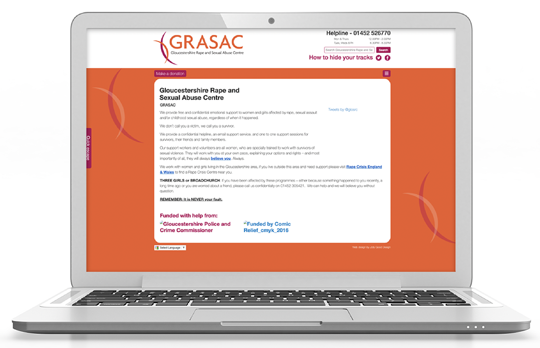
Brand review in a nutshell: 'municipal', matter-of-fact and souless, harsh logo / colours.
Re-brand: gentler, personal (illustrations of women) tone of voice and content: anonymised testimonials, conversational statments, humanised data presentations. Colours echo national Rape Crisis organisation. More informal, empathetic style seeks to speak directly to affected women. (art directed external agencies for logo and web design).

Annual Review / case-for-support
Support workers' engagement card
Top: front and reverse of old card; rebranded version with improved information heirarchy below.

Social media campaign (awareness building):
