This is where I show you design projects that are outside of the main catagories of my work, and share small insights, observations, tips on process and creative problem-solving (and the occasional gripe).
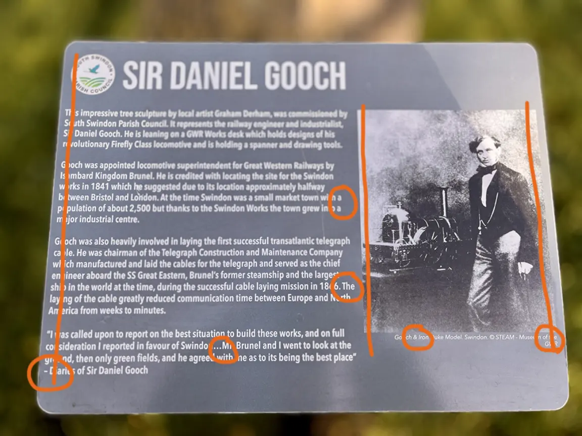
GWR Park in Swindon is rapidly becoming my favourite park precisely because it has little bits of interest added over the last few years AND at the same time this irks: tiny width margins, no space after ellipsis, single character words at the end of a line (and repeated together), widows (a single word left hanging on a new line), a hyphen does not do the same job as a dash, and an ampersand* (&) is not interchangeable with 'and'.
I know that councils are cash-strapped, that doing it yourself is cheaper, that most people didn't spend an entire term learning about typography and typesetting, aren't massive typography pedants, and won't either notice or care – and the overall design is pretty good... but there are standards lost in time and technology.
*ampersands are used for 'immutable pairings', things that always go together: Marks & Spencer, Morecombe & Wise, rock & roll, H&M.
Design miscellany / hospitality / marketing
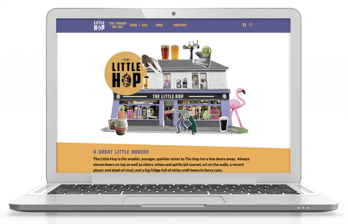
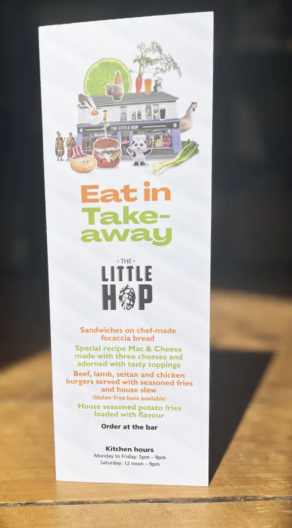
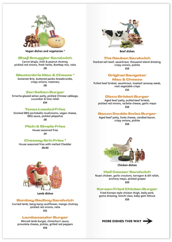
Gurt Lush Pub Co. Ltd. The Little Hop, Swindon
A quirky little boozer. Menu, website and events design. Collage design created with photos of pub paraphenalia, staff and beers.
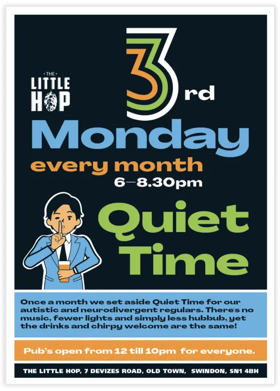
Possibly the first UK pub to set aside a quiet time to welcome neurodivergent adults. I also worked behind the bar.
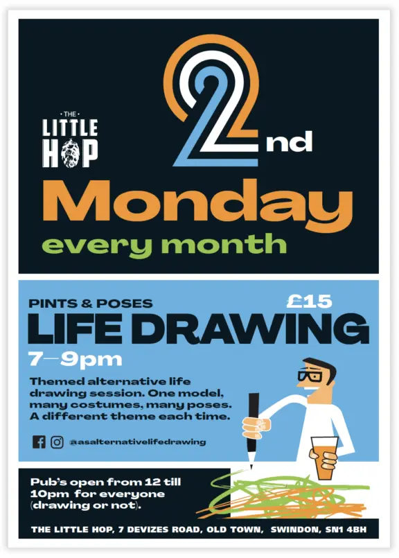
Alternative Life Drawing is run by Artsite, Swindon. Click the image.
design miscellany / author / book design / publishing
Bobbydazzlers: a potent collection of mankind's innate creative expression
I wrote, designed and published this 'novelty' 48-page book, ISBN: 978-1-80352-769-7. Unsure why I started taking photos of "naïve, instinctive, phallic street grafitti" and posting on Instagram, then Tom Blake suggested I create a book and offered to write a foreword. It's crammed with 66 specimens, an author's note and pseudo-science statistical diagrams.
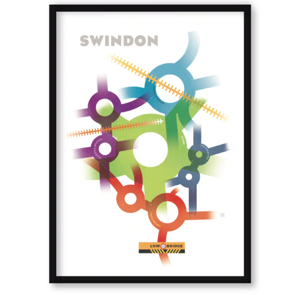
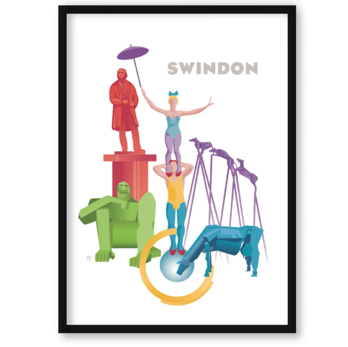
Swindon roundabouts: the infamous Magic Roundabout and four other Swindon roundabouts
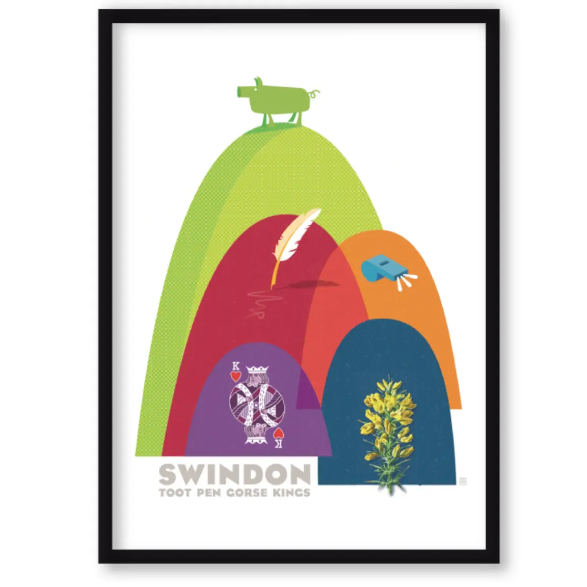
Vector illustration artworks. Colour-themed set of three limited edition prints celebrating the town's infamous roundabouts, its many hills and public art. A few still left for sale (£50): [email protected]
Swindon hills: places in the town – Toothill, Kingshill, Gorse Hill, Penhill (and the name Swindon derives from 'swine dune' – pig hill)
Assume the reader (potential donor, funder or supporter) has no prior knowledge of your organisation, or context of your work – and not much time to work out your message. Make your message quick and easy for anyone to understand: explain terms understood within your organisation or sector.
Ask yourself the questions that funders and/or supporters would want to see answered. Be specific about your aims and your ask for donations: generic aims such as "to improve wellbeing", "support and champion a cause" or "to help people" don't help anyone understand what you do, or why they should fund or support your cause.
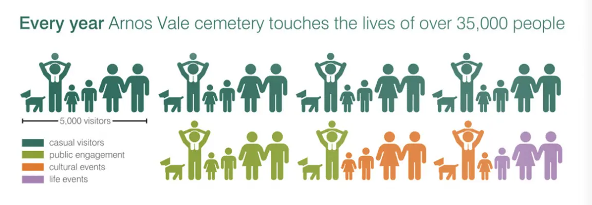
Offer quantitive information where possible. Infographics can outline a 'numerical situation' at-a-glance.
Infographic from Arnos Vale Cemetery Trust case-for-support document explaining visitor numbers and segmentation
Being open and transparent (and human) builds trust: Who is in charge? Who's on the board? How is funding being spent? What are your challenges? What are your triumps? Contact information and/or short bios for relevant key staff help people understand who you are.
Invite involvement: Tell people how they can get involved and how it would help.
Non-profits thrive on reciprocity. People give or support partly because of altrusim and partly because it makes them feel good and part of a community. Always thank and 'pay back' – a phone call to say thank you, a mention in your newsletter or an invitation to participate are very valuable.
Test your communications' ideas with someone 'outside' of your organisation (like me). They can often identify factors that might be overlooked by colleagues who are immersed in the 'day-to-day' and know your organisation inside-out.
Talk about what you do today (no-one needs a detailed historical foundation story about your evolution); keep the audience up to date with your progress.
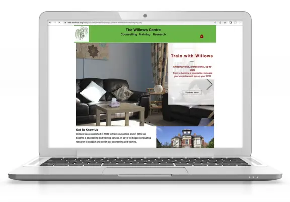
Make sure images support your message. Choose images that make sense to someone who doesn’t know you yet.
A photo of an empty living room may not say 'counselling' to anyone who hasn't seen the room in which that takes place. Finding images to portray sensitive services can be tricky but avoid images that don't really say anyting at all
It’s not about you, it’s about your (potential) supporters and service users. Reframe sentences that start with ‘we’. Talk directly to the people you want to reach directly and empathetically. See examples below:
A heritage charity's website introduction – talking about themselves:
“Welcome to [our] website. Here you will find a range of information about who we are and what we do. We work hard to make the place where we all live more attractive, enjoyable and distinctive. We encourage high standards […]. Whilst helping to shape the future, we strive to protect and celebrate […]
Suggested improvement: less about 'us', more about the benefits for everyone:
By celebrating and protecting local heritage, [Charity] is dedicated to making [place name] a more attractive, enjoyable and distinctive place for us all to live now and in the future”
Design miscellany / book design
Franks & Ernest: the life and art of Frank Ernest Quinton
Book design commission by the author who supplied high-resolution scans and the manuscipt. Work involved lots of planning, colour balancing and cleaning up of images in Photoshop, fact-checking and sub-editing text. Additional and last minute changes to the size and extent of the book meant additional work and print management project management to produce this hardback 'coffee table' book celebrating the life of a very accomplished Swindon watercolourist, Frank Quinton.
ISBN 978-1-5272-9291-8
Above: folio 8 (the last chapter) + front and back covers. Produced as a hard-cover book with dust cover.
insights / design
Design thinking and why it's not the same as art (or clever software)
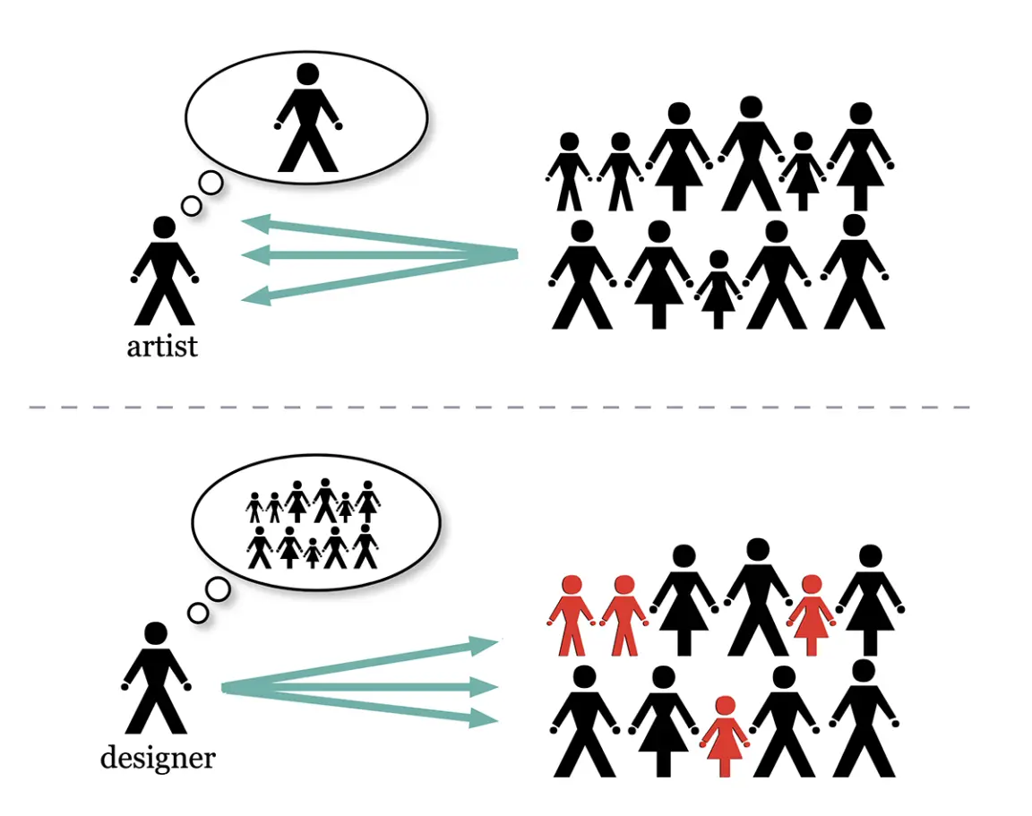
Diagram to show the different motivations of artists and designers my KS2 ‘introduction to graphic design’ schools workshops (to encourage kids who said they were 'rubbish at art' that they could, regardless, be good at design.
The difference between Art and Design is expression and communication – artists often aim to express feelings, interpretations and emotions. It is entirely subjective. The artist wants the viewer to understand their personal perspective.
Whereas Graphic design is mostly about communication. Making sure the viewer notices and understands the message, acts or feels a certain way is much more important to the designer than their own feelings. Design is problem solving: how to best get the message across given specific conditions. The designer keeps the audience in mind . The style may be subjective, but design can be judged objectively
Note to clients: this means you can constructively critique a designer’s work without fear of upsetting them. Feedback helps a project evolve.
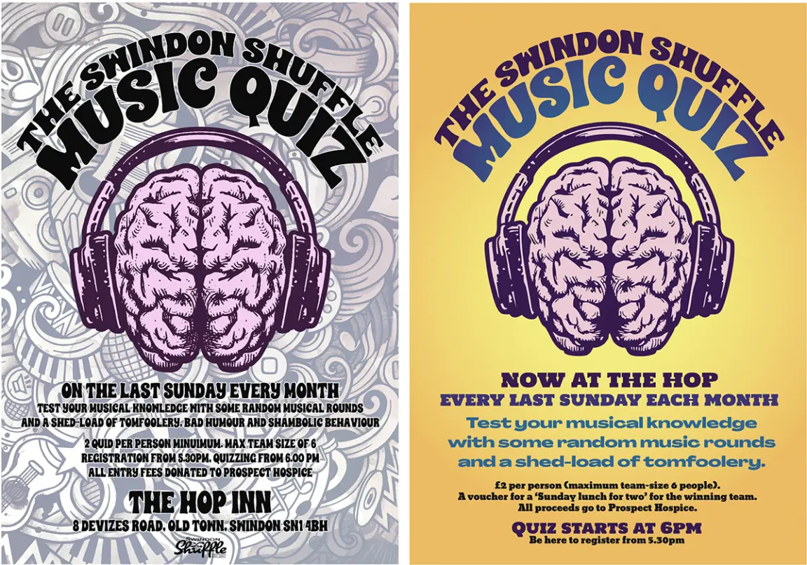
Good design software is not the same as good design. Online apps. like Canva, are good in the hands of a designer – decoration is not the same as design. See below
Left: by a non-designer. Lots of 'decoration' but hard to read. The problem: design a poster for display at the venue, that passers-by will notice, that communicates what the event is, change of venue, event frequency and time. The concept, image and title layout are good. All capital letters and a quirky font on a crazy background fail to get the message across in the time someone walks by. Sometimes less is more.
“It's not about [the designer], it's about finding clever ways to successfully articulate somebody else's message... Design isn’t self-expression.
It’s translation. It’s articulation. It’s communication.”
Peter Saville, co-founder of Factory Records