Re-brand of Swindon Town Centre / inSwindon BID Co. Ltd.
placemaking / brand design
Swindon Town Centre / inSwindon BID Co. Ltd logo
Funded by the town centre's businesses, inSwindon BID Co. Ltd managed and promoted Swindon Town Centre through public activities, safety initiatives and street improvements to enhance footfall.
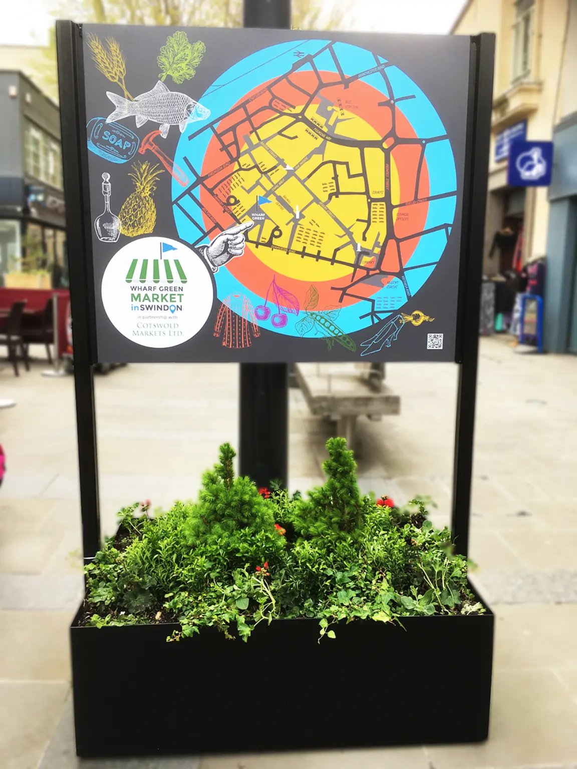
The new brand developed the existing logo's map pin motif (see below), adding stylised, recognisable town centre buildings and the Brunel statue at its heart
inSwindon's brief: "highlight Swindon Town Centre's unique character; create a sense of place, belonging and local pride; drive destination marketing to regional communities and beyond."
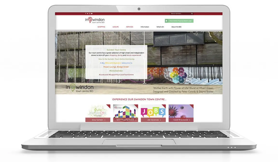
The previous brand felt quite generic / corporate so changes were needed to meet the new brief
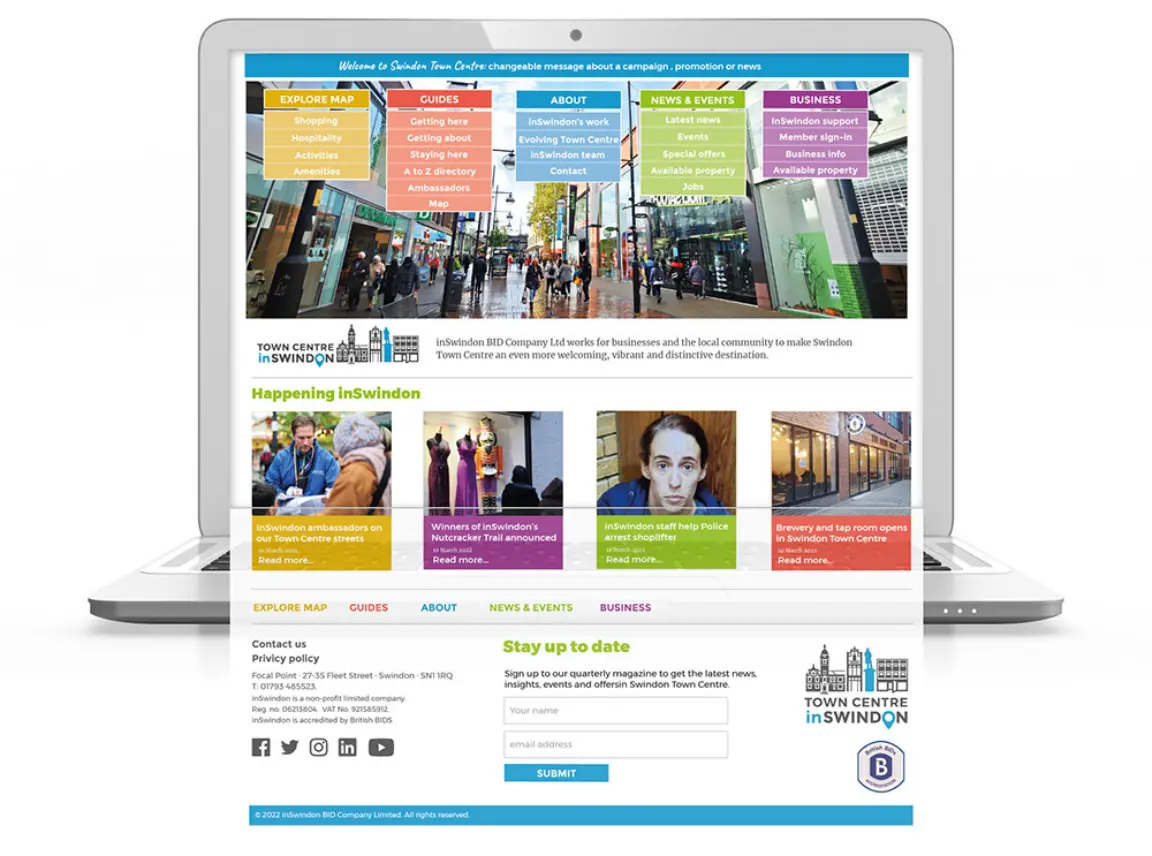
I designed the site, created the wireframe and content, and briefed the GIS web developers, Nautoguide
New colour-coded sections matched brand aims, more vibrant colours, easier to connect and a simple CMS to (hopefully) enable in-house staff to maintain brand styling
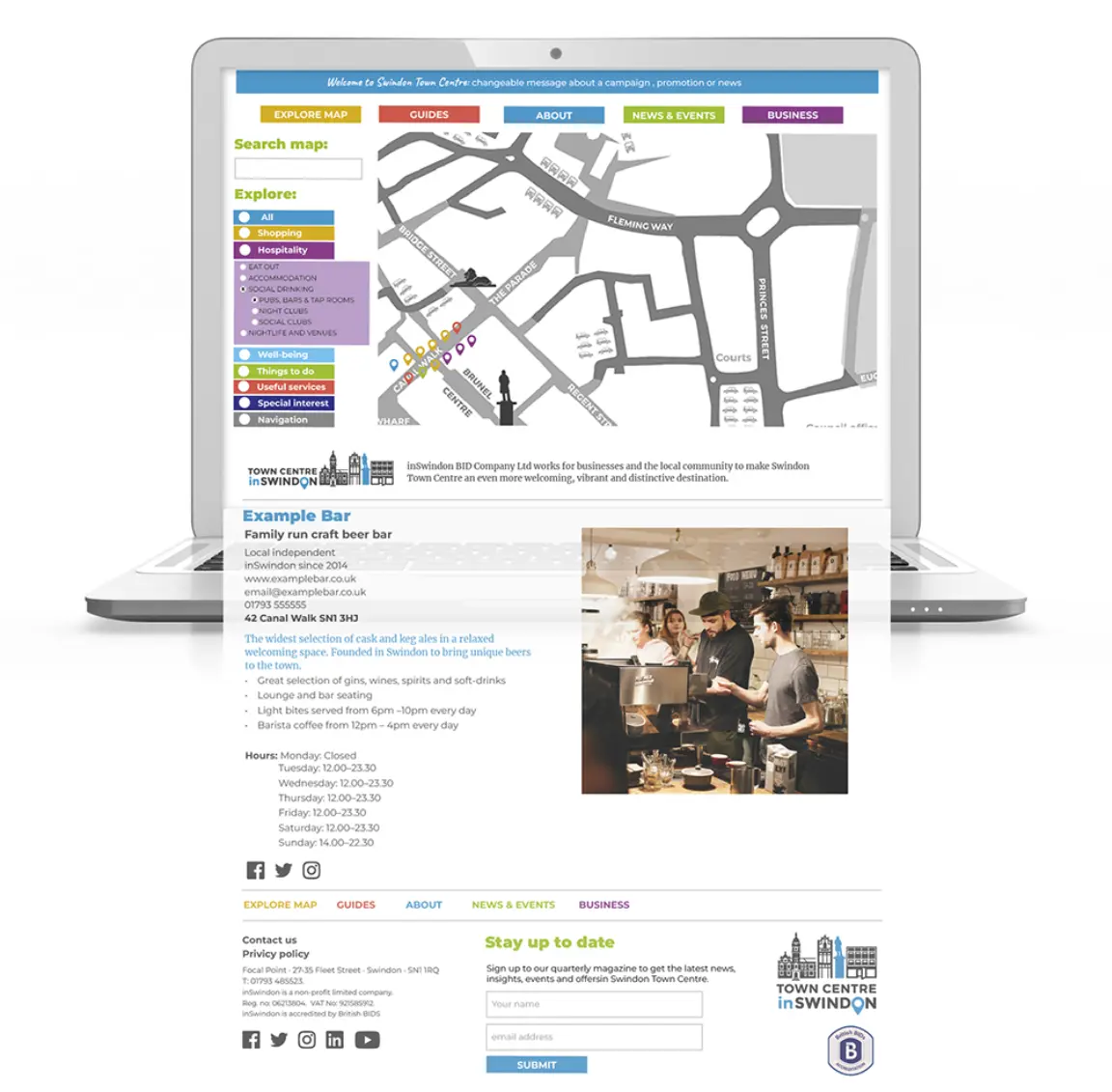
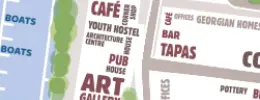
The map allowed visitors to search within categories, and click on a pin to see each business' details
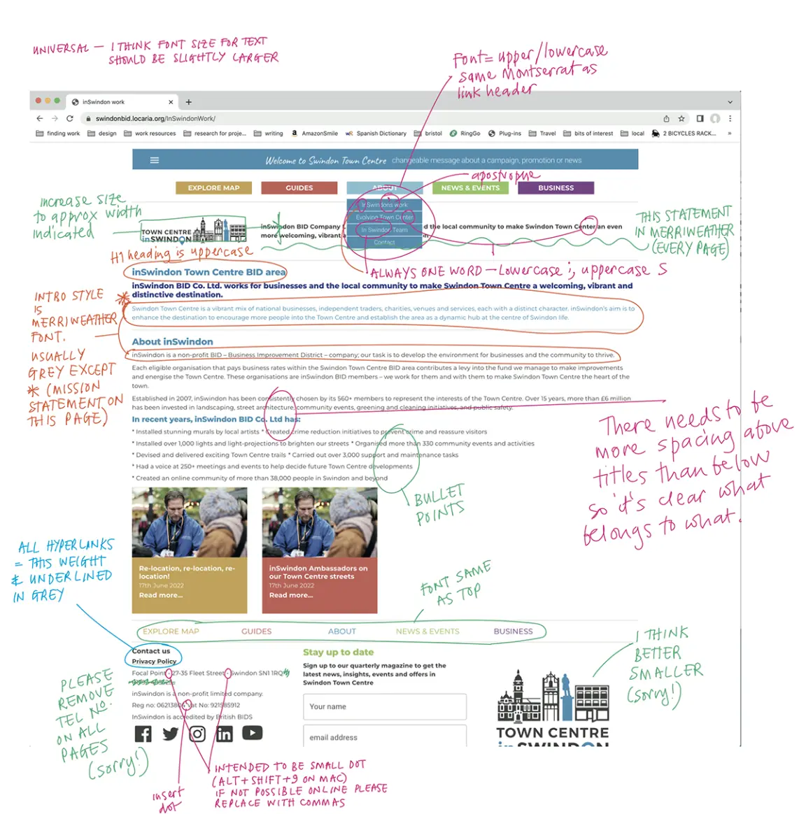
My mark-ups for the web developer. A glimpse behind the curtain!
The previous website which ours replaced
My involvment with inSwindon began with a review of the exiting wesite, flagging issues and making recommendations for improvement. Read the 12-page report.
maps / brand / placemaking
inSwindon town centre information panel
Creating awareness of the newly established bi-weekly market (I also designed the market logo).